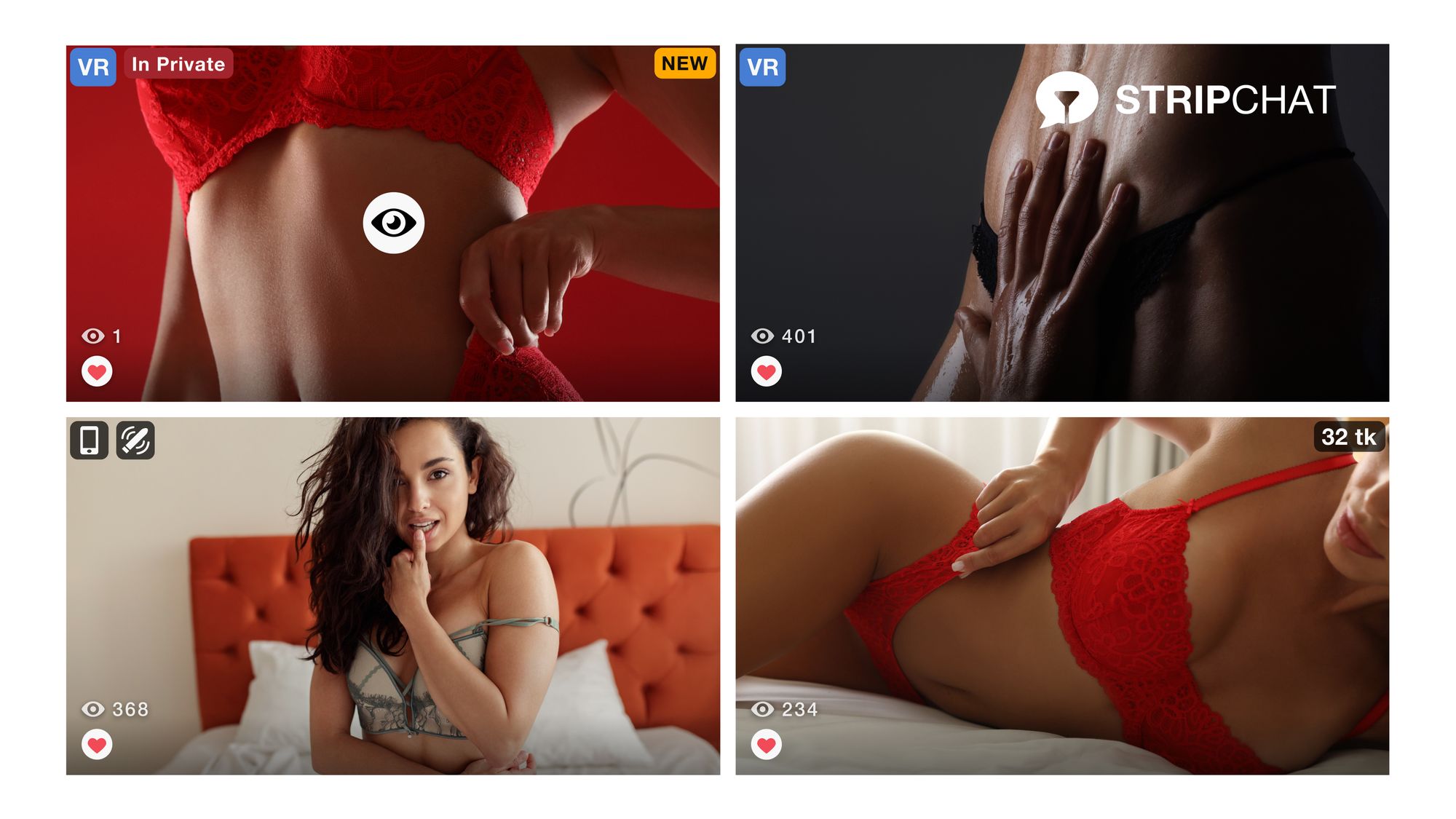
Creating captivating content: tips for designing eye-catching thumbnails

As a content creator, one of your primary goals is to draw attention to your content and entice viewers to engage with it. In the crowded digital landscape, where countless videos and posts compete for attention, having captivating thumbnails can make all the difference and be a game-changer.
The importance of video thumbnails
A video thumbnail is like a book cover for your video. It's what attracts potential viewers as it serves as the first impression. If they find it intriguing, they’ll click on the video. Therefore, having an appealing and eye-catching thumbnail is key.
Unfortunately, the importance of thumbnails for videos is often overlooked. Many people don't know how to create video thumbnails that truly capture viewers' attention. If your video thumbnail creation skills need improvement, we're here to help you up your game.
How to create an attention-grabbing thumbnail

So, let’s start with the basics: the tools you will use. You’ll need some special software to create your thumbnail. The most common one is Photoshop, as it offers all types of design elements to produce the perfect thumbnail. However, if you’re not familiar with the software, it can be tricky to know how to get started. That’s why as an alternative, you have Canva, which is an online graphic design software that anyone can use, even non-designers.
Now that we got the technical part out of the way, here are some tips for designing a great thumbnail that will turn heads.
Depict what your video is about
Your thumbnail should show viewers exactly what they can expect from your video, so make sure it accurately reflects the content of the video. Don't use misleading or unrelated images that might disappoint or confuse viewers. Being accurate is important for building trust and keeping viewers engaged.
Size matters
When designing thumbnails, it's important to consider the dimensions. Each platform has different recommended sizes, so you must check with yours. By creating your thumbnail with the right size, you ensure that it will look crisp and clear across different screen sizes, from smartphones to large desktop monitors.
Use high-quality material

It should go without saying, but you either create your thumbnail with high-quality images or graphics, or you don’t create it at all. Your thumbnail must look professional, which can only be achieved with HD imagery.
Put a face on it
Humans are naturally drawn to faces. Including a face in your thumbnail, especially one making direct eye contact, can establish a connection with viewers and make them more likely to click. Experiment with expressive faces that convey strong emotions.
Keep it simple
Don't overcrowd your thumbnails with excessive text or unnecessary elements. Keep them simple, concise, and easy to read, even in smaller sizes. Remember, viewers often skim through multiple videos, so your thumbnails should grab their attention swiftly.
Consider close-ups
Close-up shots of objects or people are more powerful in thumbnails. Since thumbnails are often small, using wide shots might make it difficult for viewers to discern details. By filling the frame with a close-up shot, you can engage viewers and pique their curiosity.

Harness the power of color
Bright and vibrant colors can capture viewers' attention and make your thumbnails stand out. Consider using a brightly colored background or image to create a visually striking thumbnail. Another technique is to utilize complementary colors, which can create a visually intense and attention-grabbing effect. However, use this technique sparingly to avoid overwhelming your viewers.
Add context with text
Something, a picture alone might not convey the content of your video effectively. Consider adding a few words of text to provide context and entice viewers to click. Keep the text minimal, using a clear and easy-to-read font. Sans-serif fonts like Futura work well for thumbnail text. Remember to strike a balance and avoid overcrowding the thumbnail with excessive text.
Wrapping up
Creating the perfect video thumbnail takes some extra time, but it's definitely time well spent. Instead of users ignoring your video and choosing your competitors', a remarkable thumbnail will catch their attention and make them click through to your video.
Try out different strategies to see which ones resonate with your viewers and help build a stronger brand at the same time.
So there you have it, a few steps and tips to elevate your thumbnail game. We hope you get all the views you need to rise to the top. Enjoy the process!
You can always check the latest news on our Twitter and Reddit.


